---
title: Palmer penguins and discrete predictors
description: |
Fitting a model with discrete predictors.
execute:
freeze: true
format:
html:
code-tools: true
editor_options:
chunk_output_type: console
---
In this section we're going to look at models with one discrete predictor. These are models you may have encountered in the past.
## Load packages and data
```{r}
library(palmerpenguins)
library(rstan)
rstan_options("auto_write" = TRUE)
options(mc.cores = parallel::detectCores())
```
## Data exploration
Let's start by taking a look at the Palmer Penguin dataset by looking at the distribution of observations of bill size.
```{r}
#| fig-cap: Histogram of bill depth for all the penguins in the Palmer Penguin dataset.
library(palmerpenguins)
hist(penguins$bill_depth_mm)
```
There's quite a lot of variation in these measurements, with a suggestion of perhaps more than one peak in this distribution.
## A simplistic model
$$
\begin{align}
\text{Bill depth} &\sim \text{Normal}(\mu, \sigma)\\
\mu &\sim \text{Normal}(17.5, 2) \\
\sigma &\sim \text{Exponential}(1) \\
\end{align}
$$
Let's express the model in Stan:
```{r}
#| class-output: stan
normal_dist <- stan_model("topics/discrete_predictor/normal_dist.stan")
normal_dist
```
The model section looks very much like the mathematics shown above.
In particular, notice how the bottom block has three lines, each describing a probability distribution.
Models are devices for putting together the probability of all the quantities we are looking for.
Again, a Bayesian model separates the world into unmeasured or measured quantities. In this respect, in the Stan code we state which are observed (the data block) and which are unobserved (the parameters block).
Before we fit this model we need to get the data ready.
We'll drop NA values^[just for this toy example!], and set up the data in a list.
```{r}
# Remove all NA
penguins_nobillNA <- penguins[which(!is.na(penguins$bill_depth_mm)),]
# Assemble the data as a list
## I'm using the function with(),
## it lets me use the variable name directly
## without writing penguins_nobillNA$bill_depth_mm
list_bill_dep <- with(penguins_nobillNA,
list(N = length(bill_depth_mm),
measurements = bill_depth_mm))
## sample 4 chains, suppress counting iterations
normal_bill_dep_samp <- sampling(normal_dist,
data = list_bill_dep,
refresh = 0,
iter = 20000)
## summarize the samples for each parameter into a nice table
tableDraw <- posterior::summarise_draws(normal_bill_dep_samp)
knitr::kable(tableDraw)
```
## Plotting parameters
After we sampled from our model, we don't have one value for each of our unknown numbers; we have thousands. To get a sense of what these possible values mean scientifically, the best way to do this is to draw as many pictures as possible. We will start with making plots of specific parameters.
We can look at the distributions easily using histogram (`hist` function) or the `bayesplot` package.
```{r}
#| layout-ncol: 2
normal_bill_dep_samp_df <- as.data.frame(normal_bill_dep_samp)

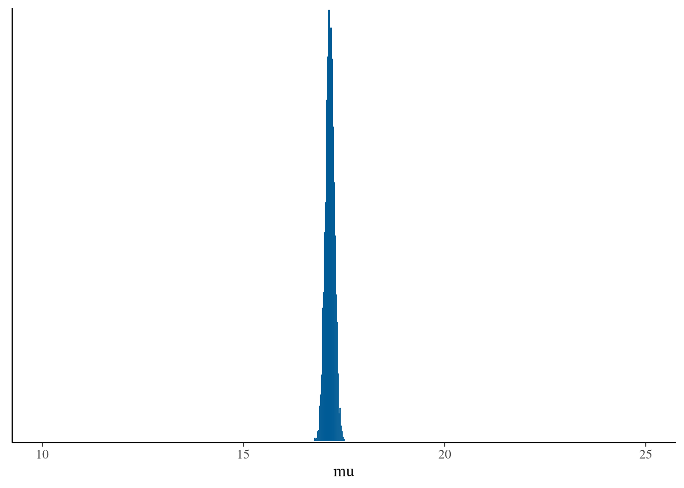
hist(normal_bill_dep_samp_df$mu, xlim = c(10, 25))
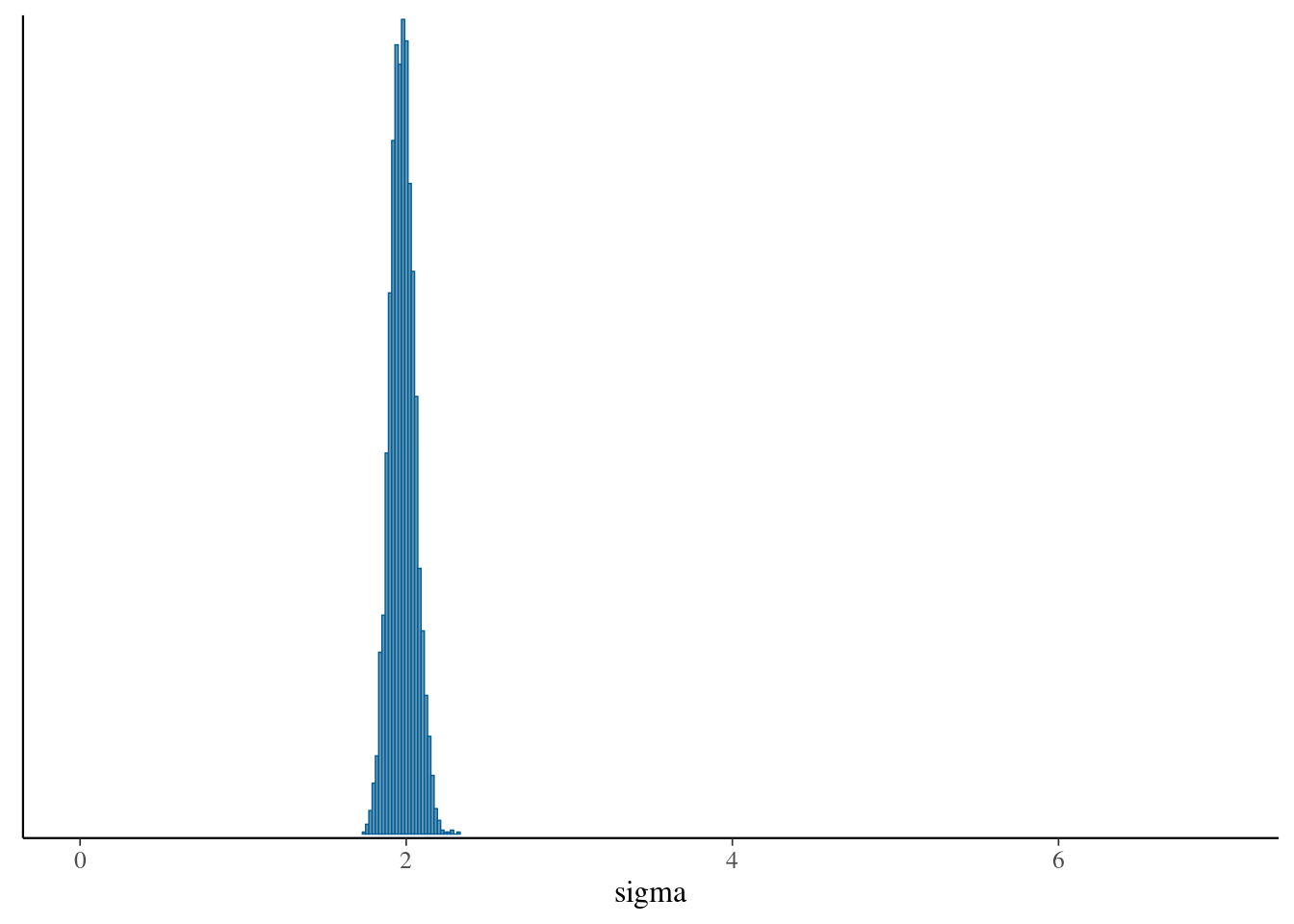
hist(normal_bill_dep_samp_df$sigma, xlim = c(0, 7))
```
Notice that the distributions do not have the same shape as the prior. This is particularly true for $\sigma$.
```{r}
#| layout-ncol: 2
hist(rnorm(200, 17.5, 2),
     xlim = c(10, 25),
     main = "mu")
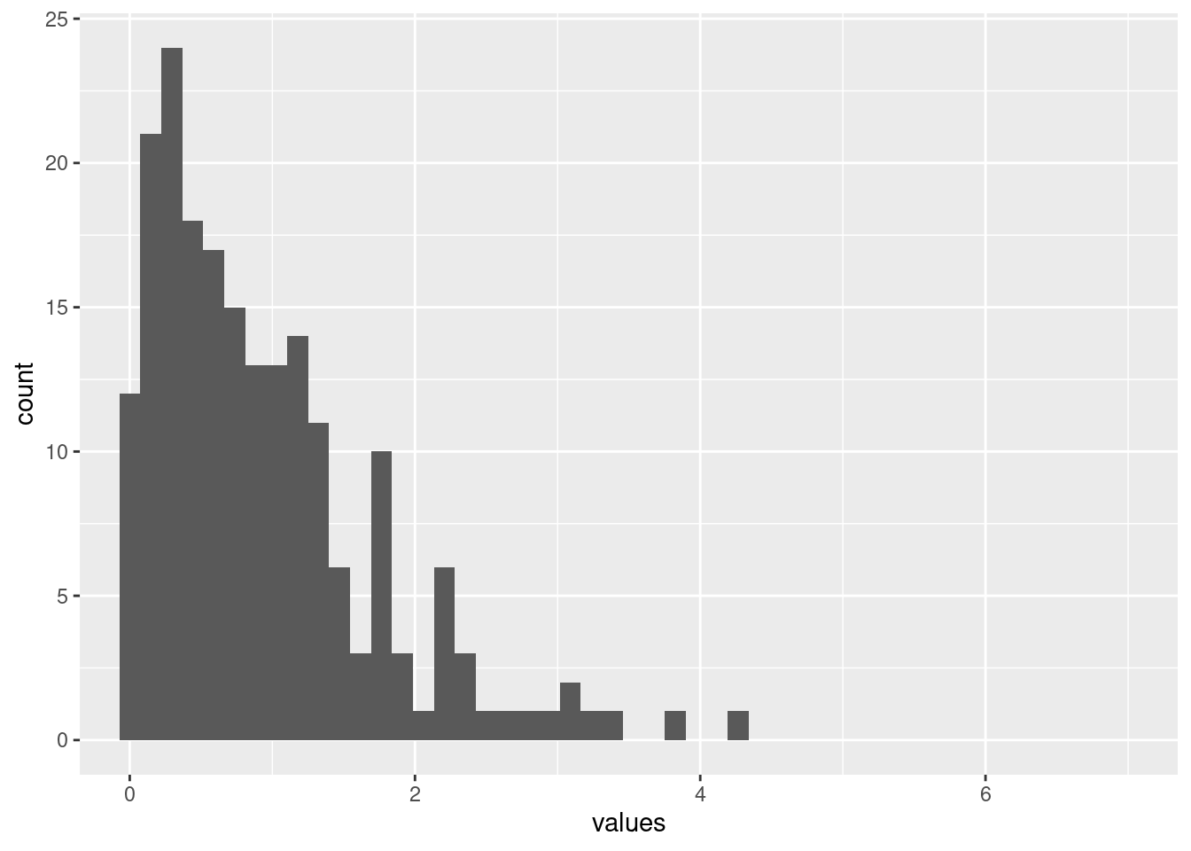
hist(rexp(200, 1),
     xlim = c(0,7),
     main = "sigma")
```
This shows an important point: the prior distribution does not determine what the posterior looks like.
## Posterior predictions: the easy way to check your model
In my experience, ecologists (rightly!) care a great deal about model diagnostics.
And with good reason: you need to know how much to trust a model before using it to make a scientific claim.
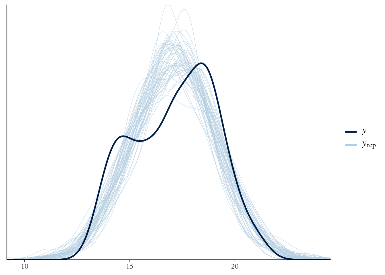
Bayesian models offer a straightforward way to show how well a model is doing: plot model predictions and compare them to the observed data.
This involves using the model as a data generating machine, which we'll look at next.
Here is the procedure for generating posterior predictions:
1. Select some posterior posterior draws
2. For each draw
a. Extract all the model parameters
b. Use the model parameters into the model. In doing so, make sure that all the same explanatory variables are **EXACTLY** the same as the original model.
c. Draw a random dataset that is the _same size and shape_ as your original data.
3. Overlay the simulated datasets on the observed data.
### Posterior prediction in R
```{r}
# Extract parameters from Stan
draws <- rstan::extract(normal_bill_dep_samp, pars = c("mu", "sigma"))

# Organise them into a matrix
draws_matrix <- posterior::as_draws_matrix(draws)

## For every posterior sample,
## (that is, for each combination of  mu and sigma values)
## draw a whole fake dataset from a normal distribution
nsamples <- 50
yrep <- matrix(0, ncol = list_bill_dep$N, nrow = nsamples)

# pick some random rows
set.seed(42)
chosen_samples <- sample(1:nrow(draws_matrix),
                         replace = FALSE,
                         size = nsamples)

subset_draws <- draws_matrix[chosen_samples,]

for (r in 1:nsamples){
  yrep[r,] <- rnorm(n = list_bill_dep$N,
                    mean = subset_draws[r, "mu"],
                    sd = subset_draws[r, "sigma"])
}

bayesplot::ppc_dens_overlay(y = list_bill_dep$measurements,
                            yrep = yrep)
```
### Posterior predictions in Stan
::: {.callout-tip}
### EXERCISE
In the code above, I show how to simulate the posterior predictive distribution using the posterior draws for $\mu$ and $\sigma$.
However, you can carry out the same process in Stan.
1. Extend the Stan code above to simulate new observations using the `generated quantities` block. (Tip: look back at the [Simulation exercise](topics/01_simulation)).
2. plot them using `bayesplot`, as above.
:::
::: {.callout-note collapse="true"}
### SOLUTION
```{r}
#| class-output: stan
normal_dist_rng <- stan_model(file = "topics/discrete_predictor/normal_dist_rng.stan")
normal_dist_rng
```
From this exercise, it can be understood that we have a powerful random number generator _inside_ Stan.
```{r}
# Sample from Stan
samp_bill_dep_rng <- sampling(normal_dist_rng,
                              data = list_bill_dep,
                              refresh = 0)

# Extract and organize the data
samp_bill_dep_rng_draws <- rstan::extract(samp_bill_dep_rng,
                                          pars = "yrep")

samp_bill_dep_rng_draws_matrix <- posterior::as_draws_matrix(samp_bill_dep_rng_draws$yrep)

# Draw density plot for 50 model iterations and the measured data on top
bayesplot::ppc_dens_overlay(y = list_bill_dep$measurements,
                            yrep = head(samp_bill_dep_rng_draws_matrix, 50))
```
The code is much shorter, because there is less to do in R.
:::
Both the R and Stan code gives the same result: **The posterior predictive distribution**.
This gives us a straightfoward way to test our model's performance:
1. We use the model to generate fake observations.
2. Plot these on top of the real data
3. If the data is a really poor match, we know our model is distorted
## Different groups are different
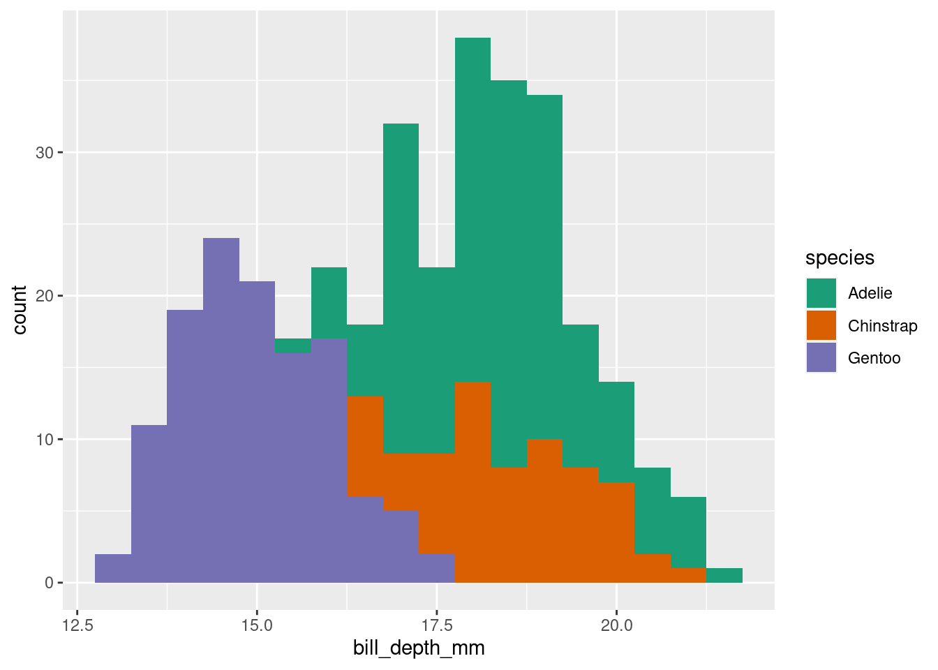
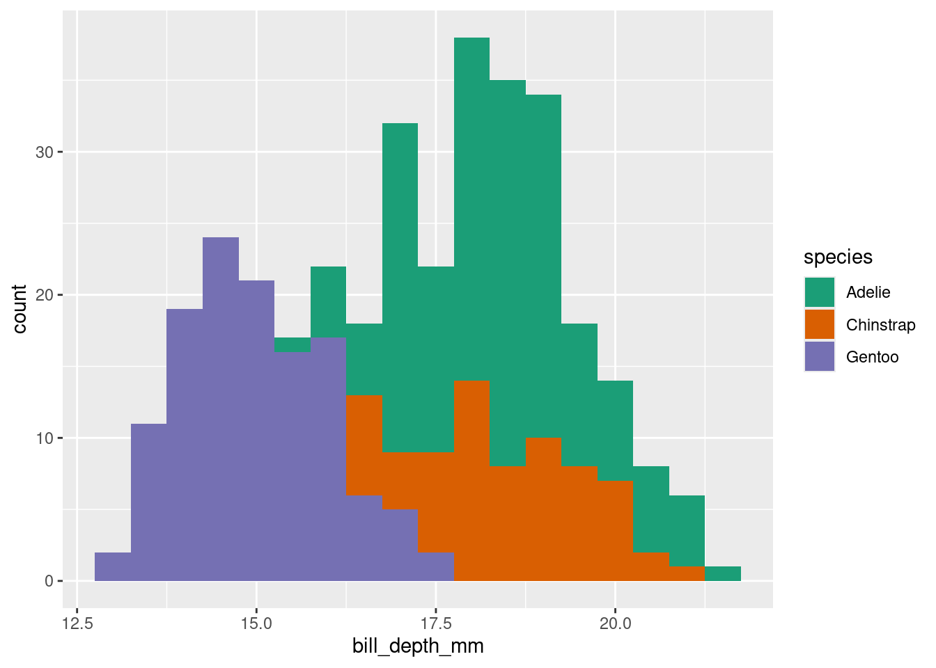
Let's add in differences among species
```{r}
br <- seq(min(penguins$bill_depth_mm, na.rm = TRUE),
          max(penguins$bill_depth_mm, na.rm = TRUE), length = 30)

# Adelie
hist(penguins$bill_depth_mm[penguins$species == "Adelie"],
     col = rgb(1, 0, 0, 0.5),
     breaks = br)

# Chinstrap
hist(penguins$bill_depth_mm[penguins$species == "Chinstrap"],
     col = rgb(0, 1, 0, 0.5),
     breaks = br,
     add = TRUE)

# Gentoo
hist(penguins$bill_depth_mm[penguins$species == "Gentoo"],
     col = rgb(0, 0, 1, 0.5),
     breaks = br,
     add = TRUE)

legend("topright",
       fill = c(rgb(1, 0, 0, 0.5),
                rgb(0, 1, 0, 0.5),
                rgb(0, 0, 1, 0.5)),
       legend = c("Adelie",
                  "Chinstrap",
                  "Gentoo"))
```
Now we can see that the distribution of bill depth is in fact unique to each penguin species.
:::{.callout-warning}
Sometimes scientists will plot histograms of data at the beginning of a research project, and use the histogram to decide if their data are "normally distributed" or not. This is not helpful and may cause you trouble! Instead, decide on a model first, and ask yourself what kind of data you expect.
:::
## Stan code for species differences
$$
\begin{align}
\text{Bill depth}_{i} &\sim \text{Normal}(\mu_{\text{species}[i]}, \sigma) \\
\mu_{\text{species}} &\sim \text{Normal}(17, 2) \\
\sigma &\sim \text{Exponential}(2) \\
\end{align}
$$
```{r}
#| class-output: stan
normal_dist_rng_spp_forloop <- stan_model(file = "topics/discrete_predictor/normal_dist_rng_spp_forloop.stan")
normal_dist_rng_spp_forloop
```
Compared to the `normal_dist_rng` Stan function, there are a few differences worth noticing:
* In the `data` block: We have a new input! A declaration of the array of integers at the top, stating if a value is associated to "species 1", "species 2", or "species 3" (or "Adelie", "Chinstrap", "Gentoo")
* `mu` is a vector now. why?
* notice the for-loop.
## Quick detour : vector indexing
A **very** useful technique, in both R and Stan, is transforming a vector with _indexing_.
Vector indexing requires two vectors:
1. A vector that contains values we want to select or replicate
2. A pointer vector that contains integers giving the positions of the elements we want to access.
For example:
```{r}
# Vector of important values
some_values <- c("taco", "cat", "goat", "cheeze", "pizza")

# Pointer vector
positions <- c(1,1,2,2,3,1,1,5)

some_values[positions]
```
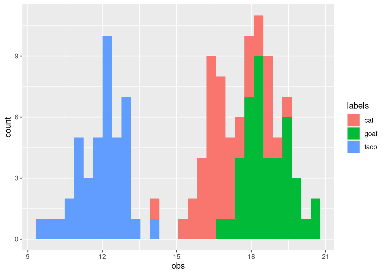
This works for any type of variables (including numbered values), and it is very useful when you want to do simulations! Let's simulate three groups with different averages.
```{r}
set.seed(42)
some_means <- c(12, 17, 19)
some_labels <- c("taco", "cat", "goat")

df_of_means <- data.frame(index = rep(1:3, each = 42),
                          the_mean = rep(some_means, each = 42),
                          labels = rep(some_labels, each = 42),
                          obs = rnorm(n = 3 * 42,
                                      mean = rep(some_means, each = 42),
                                      sd = 1))

# Histogram
br <- seq(min(df_of_means$obs, na.rm = TRUE),
          max(df_of_means$obs, na.rm = TRUE), length = 30)

# Taco
hist(df_of_means$obs[df_of_means$labels == "taco"],
     col = rgb(1, 0, 0, 0.5),
     breaks = br)

# Cat
hist(df_of_means$obs[df_of_means$labels == "cat"],
     col = rgb(0, 1, 0, 0.5),
     breaks = br,
     add = TRUE)

# Goat
hist(df_of_means$obs[df_of_means$labels == "goat"],
     col = rgb(0, 0, 1, 0.5),
     breaks = br,
     add = TRUE)

legend("topright",
       fill = c(rgb(1, 0, 0, 0.5),
                rgb(0, 1, 0, 0.5),
                rgb(0, 0, 1, 0.5)),
       legend = c("Taco",
                  "Cat",
                  "Goat"))
```
## Vector indexing in Stan
We can use this very same technique in Stan:
```{r}
#| class-output: stan
normal_dist_rng_spp <- stan_model(file = "topics/discrete_predictor/normal_dist_rng_spp.stan")
normal_dist_rng_spp
```
The only difference to the previous model is in the line with the for-loop, which is now replaced with a vectorized expression. This is faster to write and will run faster in Stan. However, it's not always possible to use this trick.
### Sampling the species model
:::{.callout-tip}
### EXERCISE
Fit one (or both) of the species-specific models above.
1. What changes do you need to make to the input data? Remember we've added a new input: a vector of numbers 1, 2, or 3 that tells us if we are working with the first, second, or third species. There are many ways to do this (e.g. try using `as.numeric` after `as.factor`)
2. Visualize the posterior with `bayesplot`. Does it look better than the model without species? How can you tell?
:::
::: {.callout-note collapse="true"}
### SOLUTION
```{r}
list_bill_dep_spp <- with(penguins_nobillNA,
     list(
       N = length(bill_depth_mm),
       measurements = bill_depth_mm,
       spp_id = as.numeric(as.factor(species))
     )
)

normal_dist_rng_spp_samp <- sampling(normal_dist_rng_spp,
                                     data = list_bill_dep_spp,
                                     refresh = 0)
```
Let's take a look at this in Shinystan
```{r, eval=FALSE}
shinystan::launch_shinystan(normal_dist_rng_spp_samp)
```
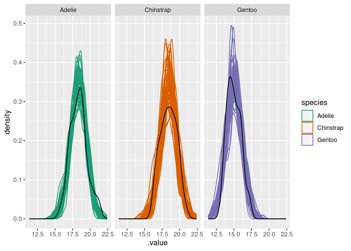
and we can repeat the posterior checking from before:
```{r}
# Extract and convert draws
spp_yrep_draws <- extract(normal_dist_rng_spp_samp, pars = c("yrep"))

# Posterior predictive check
bayesplot::ppc_dens_overlay(y = list_bill_dep$measurements,
                            yrep = head(spp_yrep_draws$yrep, 50))
```
The predicted distribution is now much more like the real data!
:::
### Visualizing species
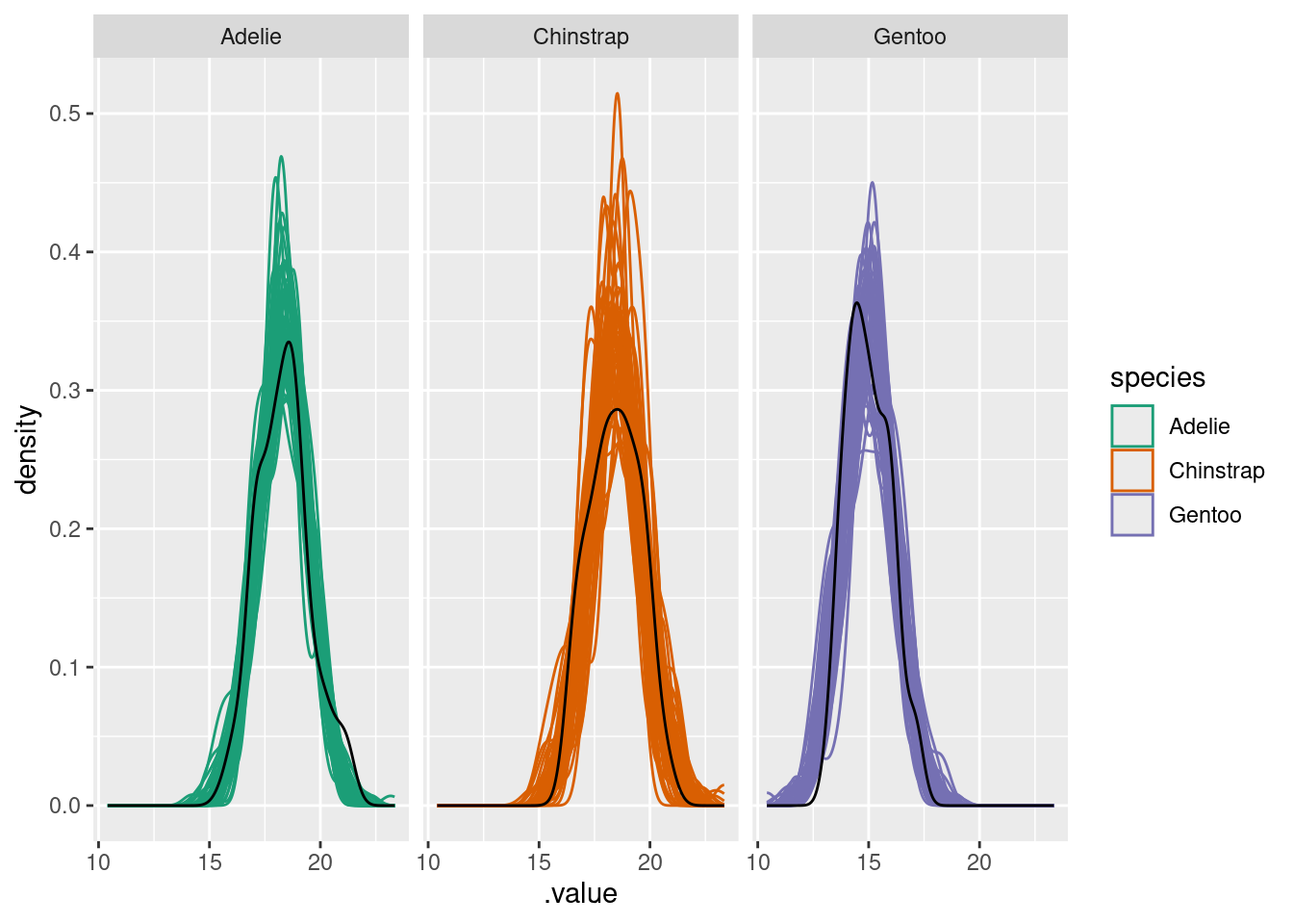
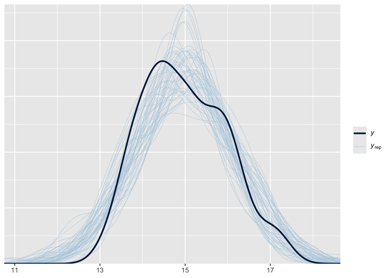
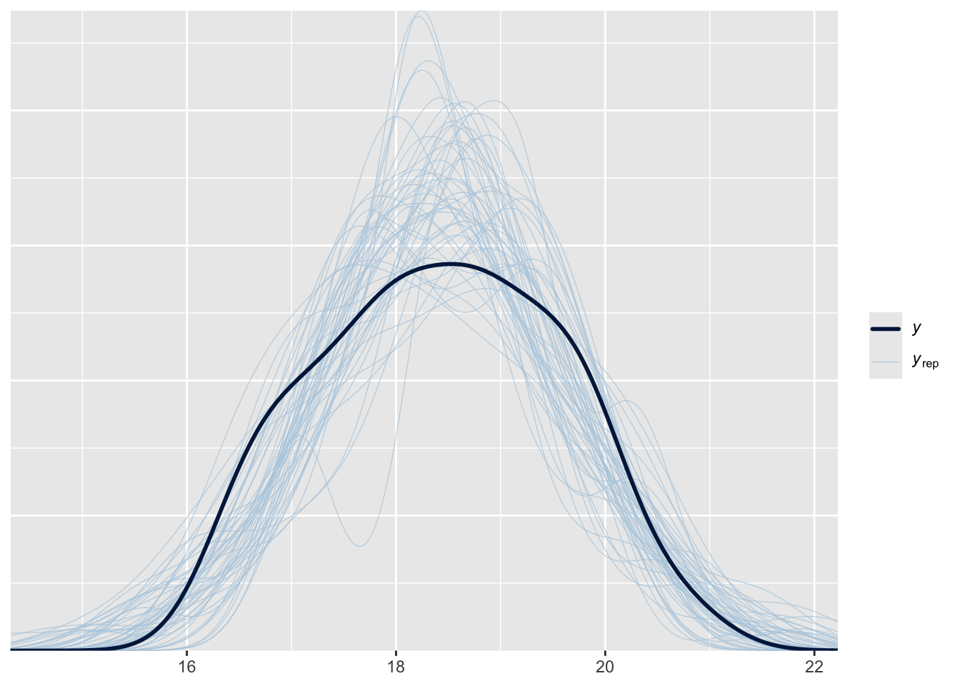
We can also make figures for each individual species.
```{r}
#| layout-ncol: 3
adelie <- penguins_nobillNA$species == "Adelie"
bayesplot::ppc_dens_overlay(y = list_bill_dep$measurements[adelie],
                            yrep = head(spp_yrep_draws$yrep[,adelie], 50))
gentoo <- penguins_nobillNA$species == "Gentoo"
bayesplot::ppc_dens_overlay(y = list_bill_dep$measurements[gentoo],
                            yrep = head(spp_yrep_draws$yrep[,gentoo], 50))
chinstrap <- penguins_nobillNA$species == "Chinstrap"
bayesplot::ppc_dens_overlay(y = list_bill_dep$measurements[chinstrap],
                            yrep = head(spp_yrep_draws$yrep[,chinstrap], 50))
```
### Exercises
#### Level 1
* Repeat this experience for another variable in the dataset. Does the same code work on bill length? What about body size? What would you change about the model (if anything)
* Use `bayesplot` to examine the fit of body size to these data.
#### Level 2
* Generate some random groups of your own, with known means. How well does the model fit these data
* The present model is fixed for exactly 3 groups. how would you change it for any number of groups?
#### Level 3
* The model assumes the same sigma for all species. what if you relax this?
### Optional!
Try this on your own data!